In the past I have seen so many reports which are not very handy for the users. The reports had a good data model, cool measures, good visualizations, but mostly it can only handle by the authors or product owners. The reason was mostly, that other users do not get help how to use the reports and/or visuals. So, here are some ideas how to provide some help to the report consumers:
1. An introduction page
Build up a page which provides some explanation about the report and the story. You can also build up s page like this for every chapter.
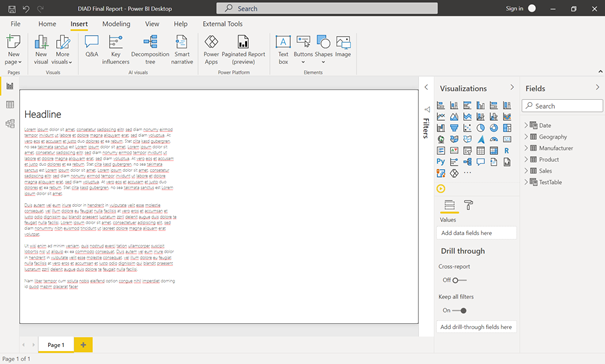
It is also very good to provide here some screenshots of every page with some explanations and some buttons which refers the users to the page. It is also a good idea to provide some links to your data catalog which explains your used data and KPI’s.
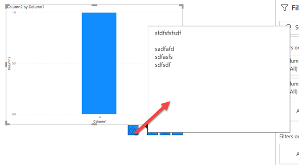
2. Use tooltips for providing help
If you have some visualizations who need an explanation, maybe you have a chart which have a hierarchy and a forecast. This can be very complex for a business user to use this visual, so it is good idea use a tooltip for this.
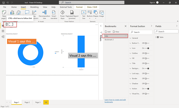
3. Use page help with bookmarks
You can implement bookmarks to display help for your whole page. To do this, make a screenshot of your page, put this image into Power Point or another tool to create images, descibe the visuals and put this picture back to a bookmark inside Power BI

So, this can be very helpful for you report users …
…. to be continued.