![]() (english version below)
(english version below)
Nachdem ich bisher Wasserfall Diagramme manuell in Excel erstellt habe, möchte ich hier zeigen, wie das auch in Verbindung mit PowerPivot für Excel funktioniert. Die Datengrundlage ist die gute alte Northwind Datenbank. Um ein Wasserfall Diagramm zu erstellen, benötige ich folgende Informationen:
- Aktueller Umsatz
- Umsatz des letzten Monats
- Verringerung und
- Vergrößerung des Umsatz
- Zeit Informationen
Mit folgendem Query lese ich die Daten und löse das Pivot auf, damit ich die Daten besser in PowerPivot verarbeiten kann:
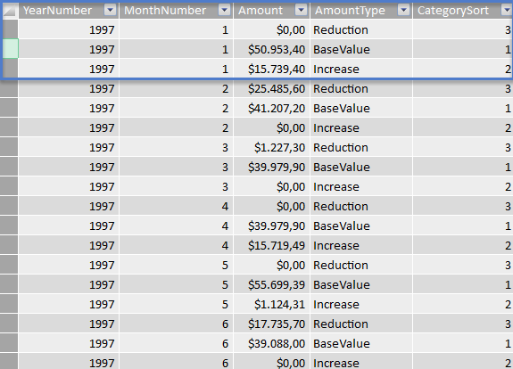
SELECT
 YearNumber
 , MonthNumber
 , Amount
 , AmountType
 , CASE AmountType
  WHEN 'BaseValue' THEN 1
  WHEN 'Increase' THEN 2
  WHEN 'Reduction' THEN 3
 END As CategorySort
FROM ( SELECT
  CASE
   WHEN Data.SalesAmount - Data.SalesAmountLastMonth  < 0
    THEN (Data.SalesAmount - Data.SalesAmountLastMonth) * -1
    ELSE 0
   END As Reduction
  , Data.SalesAmountLastMonth -
   CASE
   WHEN Data.SalesAmount - Data.SalesAmountLastMonth  < 0
    THEN (Data.SalesAmount - Data.SalesAmountLastMonth) * -1
    ELSE 0
   END As BaseValue
  , CASE
   WHEN Data.SalesAmount - Data.SalesAmountLastMonth  > 0
    THEN (Data.SalesAmount - Data.SalesAmountLastMonth)
    ELSE 0
   END As Increase
  , Data.MonthNumber
  , Data.YearNumber
 FROM (
  SELECT
   MONTH(Orders.OrderDate) As MonthNumber
   , YEAR(Orders.OrderDate) As YearNumber
   , SUM(Quantity*UnitPrice) As SalesAmount
   , (
    SELECT SUM(od1.Quantity*od1.UnitPrice) FROM [dbo].[Orders] o1
    INNER JOIN [dbo].[Order Details] od1 ON od1.OrderID = o1.OrderID
    WHERE MONTH(o1.OrderDate) = MONTH(DATEADD(mm, -1, MAX(Orders.OrderDate)))
    AND YEAR(o1.OrderDate) = YEAR(DATEADD(mm, -1, MAX(Orders.OrderDate)))
   ) As SalesAmountLastMonth
    FROM [dbo].[Orders]
    INNER JOIN [dbo].[Order Details] ON [Order Details].OrderID = Orders.OrderID
    WHERE Year(Orders.OrderDate) = 1997
    GROUP BY
   MONTH(Orders.OrderDate)
   , YEAR(Orders.OrderDate)
  ) data
 ) t
 UNPIVOT (Amount for AmountType in (Reduction, BaseValue, Increase)) As Amount
ORDER BY YearNumber, MonthNumber
Nachdem diese nun eingelesen wurden sind, habe ich zu jedem Monat 3 Zeilen mit den notwendigen Informationen. Nun lasse ich die jeweilige Kategorie noch sortieren, damit der Basis Wert im Diagramm unten liegt. Übergibt man nun die Daten in ein gestapeltes Diagramm, sieht das folgendermaßen aus:
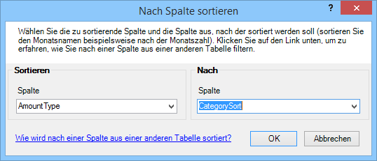
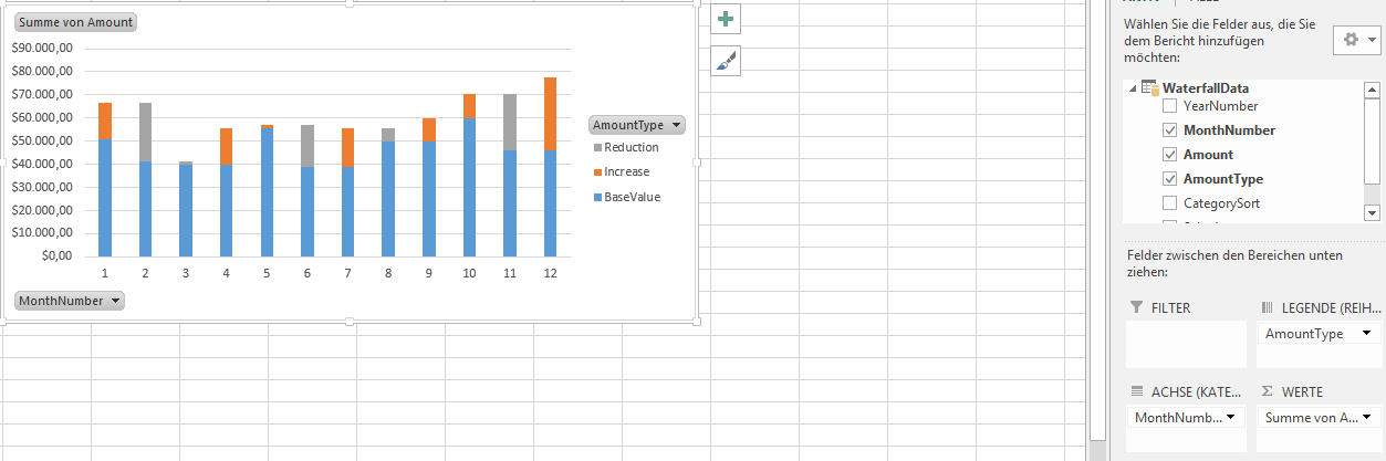
Nun müssen lediglich folgende Anpassungen gemacht werden:
- Die Kategorie mit dem Basis Wert ohne Farbe einstellen
- Verlustwerte rot färben
- Gewinnwerte grün färben
- Die Beschriftungen ausblenden
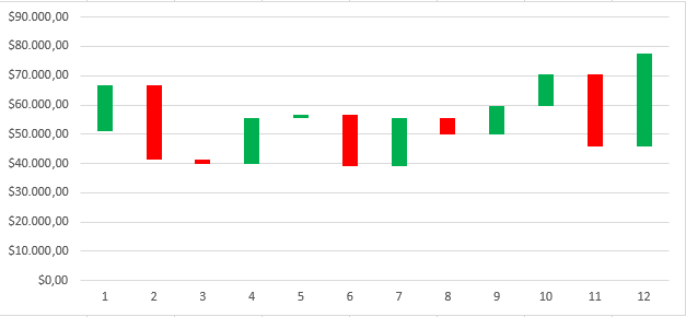
Voila! Fertig ist das Wasserfall Diagramm mit Hilfe von PowerPivot.
Waterfall Chart with PowerPivot
After I’ve created waterfall charts manually in Excel, I want to show here how this works in conjunction with PowerPivot for Excel. The data is from the good old Northwind database.
To create a waterfall chart, I need the following information:
- Current sales
- Turnover last month
- reduction and increase in the sales
- Time information
With the following query I read the data and make a unpivot so I can better handle the data in PowerPivot:
SELECT
 YearNumber
 , MonthNumber
 , Amount
 , AmountType
 , CASE AmountType
  WHEN 'BaseValue' THEN 1
  WHEN 'Increase' THEN 2
  WHEN 'Reduction' THEN 3
 END As CategorySort
FROM ( SELECT
  CASE
   WHEN Data.SalesAmount - Data.SalesAmountLastMonth  < 0
    THEN (Data.SalesAmount - Data.SalesAmountLastMonth) * -1
    ELSE 0
   END As Reduction
  , Data.SalesAmountLastMonth -
   CASE
   WHEN Data.SalesAmount - Data.SalesAmountLastMonth  < 0
    THEN (Data.SalesAmount - Data.SalesAmountLastMonth) * -1
    ELSE 0
   END As BaseValue
  , CASE
   WHEN Data.SalesAmount - Data.SalesAmountLastMonth  > 0
    THEN (Data.SalesAmount - Data.SalesAmountLastMonth)
    ELSE 0
   END As Increase
  , Data.MonthNumber
  , Data.YearNumber
 FROM (
  SELECT
   MONTH(Orders.OrderDate) As MonthNumber
   , YEAR(Orders.OrderDate) As YearNumber
   , SUM(Quantity*UnitPrice) As SalesAmount
   , (
    SELECT SUM(od1.Quantity*od1.UnitPrice) FROM [dbo].[Orders] o1
    INNER JOIN [dbo].[Order Details] od1 ON od1.OrderID = o1.OrderID
    WHERE MONTH(o1.OrderDate) = MONTH(DATEADD(mm, -1, MAX(Orders.OrderDate)))
    AND YEAR(o1.OrderDate) = YEAR(DATEADD(mm, -1, MAX(Orders.OrderDate)))
   ) As SalesAmountLastMonth
    FROM [dbo].[Orders]
    INNER JOIN [dbo].[Order Details] ON [Order Details].OrderID = Orders.OrderID
    WHERE Year(Orders.OrderDate) = 1997
    GROUP BY
   MONTH(Orders.OrderDate)
   , YEAR(Orders.OrderDate)
  ) data
 ) t
 UNPIVOT (Amount for AmountType in (Reduction, BaseValue, Increase)) As Amount
ORDER BY YearNumber, MonthNumber
After I imported the data, I have 3 lines for each month with the necessary information. Now I let the respective category yet sort, so that the base value is in the chart below. Then we can create a stacked bar chart:
Now only the following adjustments must be made:
– Set the category to the base value without color
– Reduction is set to red
– Increase is set to green
– Hide the Labels
Voila! Finish is the waterfall chart using PowerPivot.